


Are you still proofreading on paper? More and more clients are looking to do away with the printing and couriering costs associated with paper proofs and are asking proofreaders to mark up changes in PDF. Editor, trainer, and volunteer extraordinaire Adrienne Montgomerie showed us how to do this with the tools in the free Adobe Acrobat Reader. Their handout from their session is here, and they have also compiled a Storify of their session here. Both of these resources are probably more useful than this write-up, but I still wanted to share some of my main takeaways from the talk.
Acrobat (the Standard and Pro versions, which you have to pay for) does have an “edit” function, but that lets you make changes directly to the document. What we’re talking about here is mark-up: using the program’s drawing or annotation tools to mark up changes that have to be made to the native file. Because PDFs are a fixed format that look the same to everyone, they’re ideal for marking up not only proofs of print materials but also websites, presentations, YouTube videos, and anything else you can capture in a screen shot.
Montgomerie uses a stylus and a Wacom tablet, which some people may find more intuitive than a traditional mouse for marking up a proof. “I prefer PDFs to paper,” they said, “because I can blow up the proof to any size. I can move my marks and resize them. I can right-click on my marks and change their properties, including weight and colour.”
“I use in blue in my mark-up,” they continued, “because I think it’s less threatening.”
Two main ways of adding mark-up to a PDF are to use either the drawing tools, where you essentially use an e-pencil to directly emulate the proofreading mark-up you’d make on paper, or Acrobat’s own annotation tools (Comment & Markup), which track your insertions, deletions, replacements, and highlights. Drawing tools are especially handy for marking up graphic novels and screen shots, where the text may not be recognizable. Be aware that for layered text, text selection for the annotation tools isn’t perfect; sometimes Acrobat chooses the wrong layer.
You can add clarifications or instructions to the designer using the Callout tool. Before sending the proof back, you can run a spell check on all of your text boxes; designers can then copy and paste that text into the source file rather than risk introducing errors by rekeying.
Different designers have different preferences, so ask your clients what they’d prefer. Whichever method you choose, all of your changes will be logged in Acrobat’s Comments List. The Comments List is excellent for quality control (especially because some of the annotation mark-up can be hard to see):
Through the Comment & Markup tools, you can also “Attach a File as a Comment,” which is useful for long inserts. Sometimes clients won’t notice these files, though, so Montgomerie will often send them as email attachments as well.
If you’re using the drawing tools, you can make your life easier by creating or downloading a set of stamps that have your most common proofreading marks. Each stamp comes up as one comment, so if you have a caret (^) plus a hyphen (=), say, the designer doesn’t have to wade through both marks as separate comments. (Mind you, if you manage to draw both in quick succession, Acrobat may recognize them as a single mark as well.)
Under the Select & Zoom tools is the Snapshot tool, which lets you isolate a portion of your page. You can also use it to print (File » Print » Print Selection/Selected Graphic) just those isolated sections—handy if you have a tabloid document but a letter-sized printer, for example.
I wondered if anyone had ever used Annotations for Adobe InDesign, which is a plugin that lets a designer accept or reject annotation changes that a proofreader has marked up in a PDF. Nobody in the room seemed to have used it, and I’m still curious about it. (Maybe InCopy has obviated this tool, but not everyone wants to buy or subscribe to InCopy.)
Line breaks like
Mr.
Lee
or
World War
II
hinder readability because readers have to scan to the next line before they receive the information that completes the concept they’re reading about. In these cases, we want to keep the words together, and the best method is to use a nonbreaking space.
I once worked with a company that output its final reports from Word, and whenever something like “$6 million” broke over a line, the in-house staff would use a soft return before the “$6” to push it to the next line. In general, using soft returns is poor practice, because if you delete anything from the line above, you end up with a short line or unsightly gaps (if the text has been fully justified). It’s also poor practice for text that may be repurposed for a reprint or in a different medium: whenever the text reflows, the soft return will yield a shortened line that buggers up the flow of the text.
Instead, a nonbreaking space between “$6” and “million” would tell Word not to break a line at that point. It would keep the entity of “$6 million” together, without disrupting the line length.
You can insert a nonbreaking space in Word by using the shortcut key Option + Space on a Mac or Ctrl + Shift + Space on a PC. The control code for nonbreaking spaces in Word’s Find and Find & Replace functions is ^s.
In a traditional print workflow, the proofreader flags these instances of bad line breaks for the designer. But changing them at the copy-editing stage would head these problems off at the pass and allow the proofreader to focus on other typos and design infelicities that a global search wouldn’t catch. These kinds of global changes are also much easier to do at copy editing—an instance of where a few seconds of effort on the copy editor’s part can save the proofreader a lot of time.
Further, for text destined for a digital format—say a website or an ebook—adding nonbreaking spaces at the copy edit will ensure that the text appears as it should, regardless of reflow.
To save you from having to search each case individually, here are some wildcard searches that can help you do global searches for situations that require a nonbreaking space. This list isn’t exhaustive but should cover the most common cases.
Make sure you have checked off “Use Wildcards” in Word’s Find and Replace dialog box. In some cases, you can safely use the Replace All button; in others, you should go through each occurrence and evaluate it individually.
(Some workflows expect the designer to make these global changes. In InDesign, the codes are different, and I won’t cover them here, but the situations in which you would use the nonbreaking spaces are the same, so you can still use the list below as a reference.)
Depending on style:
| Find what | Replace with | Notes |
|---|---|---|
| ([0-9]) (<[ap]m>) | \1^s\2 | Safe to replace all |
| ([0-9]) ([ap].m.) | \1^s\2 | Safe to replace all |
These searches will put a nonbreaking space after a digit and before “am”/“a.m.” and “pm”/“p.m.”
Depending on style:
| Find what | Replace with | Notes |
|---|---|---|
| (<[ADFJMNOS][A-z]{2,8}>) ([0-9]) | \1^s\2 | Evaluate case by case |
| (<[ADFJMNOS][A-z]{2,8}>.) ([0-9]) | \1^s\2 | Evaluate case by case |
These will put a nonbreaking space both between the month and date and between the month and year (e.g., June 15, 2014 or June 2014).
Transpose the stuff in the parentheses if your style is to state the date before the month (e.g., 25 July).
Depending on style:
| Find what | Replace with | Notes |
|---|---|---|
| ([0-9]) (<[BC]>) | \1^s\2 | Safe to replace all |
| ([0-9]) (<[AD]>) OR (<[AD]>) ([0-9]) | \1^s\2 | Safe to replace all |
| ([0-9]) (<BCE>) | \1^s\2 | Safe to replace all |
| ([0-9]) (<CE>) | \1^s\2 | Safe to replace all |
| ([0-9]) (<BP>) | \1^s\2 | Safe to replace all |
These searches will put a nonbreaking space between the year and AD/BC; BC/BCE; or BP (before present).
Depending on style:
| Find what | Replace with | Notes |
|---|---|---|
| (<c.>) ([0-9]) | \1^s\2 | Safe to replace all |
| (<ca.>) ([0-9]) | \1^s\2 | Safe to replace all |
These searches will put a nonbreaking spaces after “c.” or “ca.” for circa.
If you are using the spaced en dash (rather than a closed em dash), the first space should be nonbreaking. (The pound sign # should be replaced with a tap of the space bar when typing these into the “Find what” box.)
| Find what | Replace with | Notes |
|---|---|---|
| #– | ^s– | Safe to replace all |
Same thing if you have spaced ellipses:
| Find what | Replace with | Notes |
|---|---|---|
| #… | ^s… | Safe to replace all |
(In French, there’s a nonbreaking space before colons and sometimes exclamation points and semicolons. If the text was created with the French dictionary and autocorrect on, those nonbreaking spaces were probably automatically inserted; otherwise you may have to put them in.)
If your style has a space between initials, that space should be nonbreaking:
| Find what | Replace with | Notes |
|---|---|---|
| ([A-Z].) ([A-Z].) | \1^s\2 | Probably safer to evaluate case by case |
(If your style has a space between initials but no periods, then, for the love of all that is merciful, ask whoever decided on this readability-hindering style to change it.)
Again, replace # with a tap of the space bar in the “Find what” box.
| Find what | Replace with | Notes |
|---|---|---|
| <([DM][rs]{1,2}.)# | \1^s | Safe to replace all |
This search puts a nonbreaking space after “Mrs.,” “Ms.,” “Mr.,” and “Dr.”
| Find what | Replace with | Notes |
|---|---|---|
| <(St.)#([A-Z]) | \1^s\2 | Evaluate case by case |
This search puts a nonbreaking space after “St.” Although the uppercase letter that follows probably makes it safe to replace all in most situations, evaluating case by case will let you exclude instances where “St.” is used as an abbreviation for something other that “Saint.”
And, once again, replacing # with an actual space in the “Find what” box:
| Find what | Replace with | Notes |
|---|---|---|
| #(<Jr>) | ^s\1 | Safe to replace all |
This search puts a nonbreaking space before “Jr.”
The most common problem is a break between the number and “million”:
| Find what | Replace with | Notes |
|---|---|---|
| ([0-9]) ([bmqt]?{1,5}llion) | \1^s\2 | Safe to replace all |
This search should replace the space between any digit and “million,” “billion,” “trillion,” “quadrillion,” and “quintillion.”
For cookbooks, these searches will cover most cases where you’d need a nonbreaking space. In all cases you can replace all.
| Find what | Replace with |
|---|---|
| ([0-9]) (tsp) | \1^s\2 |
| ([0-9]) (Tbsp) | \1^s\2 |
| ([0-9]) (cup) | \1^s\2 |
| ([0-9]) (lb) | \1^s\2 |
| ([0-9]) (oz) | \1^s\2 |
| ([0-9]) (mL) | \1^s\2 |
| ([0-9]) (L) | \1^s\2 |
| ([0-9]) (hour) | \1^s\2 |
| ([0-9]) (minute) | \1^s\2 |
If your style calls for a space before °C or °F, do an additional search for
| ([0-9]) (°[CF]) | \1^s\2 |
In all other contexts, especially scientific ones, there are too many units for me to offer a canned wildcard search that will cover all of them, so just do global searches as you come across them (replace UNIT with your unit name).
| Find what | Replace with |
|---|---|
| ([0-9]) (UNIT) | \1^s\2 |
For example:
| Find what | Replace with |
|---|---|
| ([0-9]) (kg) | \1^s\2 |
| Find what | Replace with | Notes |
|---|---|---|
| (et) (al.) | \1^s\2 | Safe to replace all |
This search keeps et al. together
| Find what | Replace with | Notes |
|---|---|---|
| (War) (I{1,2}) | \1^s\2 | Evaluate case by case |
This search will work for both World War I and World War II.
In text that uses binominal nomenclature where the genus is abbreviated (e.g., E. coli), the genus and species should stay together for readability. With your cursor in the “Find what” box, go to the “Format” button at the bottom of the dialog box, select “Font,” then select “Italic.”
| Find what | Replace with | Notes |
|---|---|---|
| ([A-Z].) ([a-z]) | \1^s\2 | Evaluate case by case |
For text that features math, you’ll want to add nonbreaking spaces before symbols for operations (e.g., +, –, ×, ÷, ±) and possibly also after.
Be on the lookout for these kinds of constructions, where the nonbreaking space should also be used:
Unfortunately, in a Word-to-InDesign workflow, the nonbreaking space (Command + Option + x on a Mac and Ctrl + Alt + x on a PC in InDesign) sometimes doesn’t come through properly. Occasionally it renders as a fixed-width nonbreaking space (which you don’t want, especially for justified texts, because it causes uneven spacing) or as a weird nonsense glyph. Alert the designer that you’ve used a nonbreaking space when you submit your manuscript so that he or she can replace it with a variable-width nonbreaking space if either of those glitches happens.
Again, if starting from Word, the nonbreaking space may not come through properly in the conversion process, but they’re important for readability in text that will reflow. The HTML code for nonbreaking spaces is . Talk to whoever is responsible for the conversion to digital to see whether it may be best to search for ^s and replace it with (or whatever the markup system you’re using uses for nonbreaking space) in Word before you submit it for e-production.
This list is meant to cover common cases only. If there’s an obvious one I’ve missed (or if you notice an error in any of the above), please let me know and I’ll add it.

We kicked off the 2013–2014 EAC-BC meeting season last evening with a packed house and an editors’ show and tell of some of our favourite time-savers. Here’s a summary*:
The trick to all of these programs, though, is that you would have had to work with your client or author early enough in the writing process for them to have used them from the outset. Nobody knew of any specific tricks for streamlining the editing of notes and bibliographies, although Margaret Shaw later mentioned a guest article on Louise Harnby’s blog by the developer of EditTools, Richard Adin, in which he writes:
The books I work on often have reference lists of several hundred entries. Using the Journals macro, I can check and correct most of the entries in the list automatically. I once timed it and found that I can check about 600 references in approximately 15 minutes; it used to take me hours, especially if I had to look up obscure and rarely cited journal names. Now I look them up once, enter them in the dataset, and move on.
Thanks to everyone who came out to the meeting and especially those who shared their tips and tricks!
*Although I knew some names at the meeting, I didn’t catch all of the names of the contributors (or I’d forgotten who’d said what). If you see an entry here and thought, “Hey—that’s me!” please send me a note, and I’ll be happy to add your name.
Having just educated two of my designer friends—both award-winning veterans of the book industry—about the discretionary/optional hyphen, I realized that maybe not everyone knows about it after all. Convincing designers to embrace the discretionary hyphen can mean saving a lot of proofing time (or, at the very least, eliminating a proofing worry), so I’ve found myself proselytizing, and I might as well do that here, too.
You’re familiar with the good ol’-fashioned regular hyphen (like the one in “ol’-fashioned”), also known as the hard hyphen. If a line breaks after a hard hyphen, it’s no big deal. In contrast, you wouldn’t want a line break after the hyphen in a phone number, say, or a numeral-unit adjective (e.g., 4-ton jack), and in those situations you’d want to use a nonbreaking hyphen.
But let’s say you’re reading a proof where a word has broken where you don’t want it to break—e.g., mi•crowave instead of micro•wave. What happens when you mark up the proof asking the designer to rebreak the word?
Well, the way many designers have been told to solve the problem is simply to add a (hard) hyphen where they want the break to happen. The approach seems to resolve the issue, but it’s not an elegant fix. What they should be using is a discretionary hyphen (Ctrl/Command + Shift + – in InDesign), which appears if the word breaks at the end of the line but remains invisible when it doesn’t.
Let’s say the designer has added a hard hyphen to “microwave” to make it break as
micro-
wave
If you made text changes that pushed “micro” to the following line, for example, you’d end up with “micro-wave” on one line, and the proofreader would have to ask for that hyphen to be deleted.
Using a discretionary hyphen would mean that “microwave” would continue to break as
micro-
wave
if it flowed over two lines but appear as “microwave” otherwise.
(Apparently, if you add a discretionary hyphen before a word, InDesign prevents that word from being broken at all—handy for some proper nouns. More information about hyphens in InDesign can be found here.)
Beyond the fact that the proofreader no longer has to worry about designer-introduced hard hyphens, discretionary hyphens are especially helpful for texts that are destined for more than one format or medium. Many publishers create their ebooks from their InDesign files, and because EPUB text can reflow, hard hyphens introduced to break a word in a desirable place for the print edition are bound to show up where they aren’t needed in the ebook. Either a proofreader has to go through the ebook text and remove them, or the publisher leaves them in and effectively sacrifices some of its editorial standards in its ebooks. Similarly, reprints (e.g., when a hardcover is reformatted as a mass-market paperback) would be a lot less work for the proofreader if designer-introduced hard hyphens were no longer a concern.
We could nip the problem in the bud a bit earlier in the production process if copy editors also used discretionary hyphens (called optional hyphens in Microsoft Word—shortcut key: Ctrl/Command + -) after common prefixes in closed compounds. (As if copy editors needed any more responsibility!) It’s probably impossible to anticipate every possible bad word break, but a few global searches would be fairly easy to do at the copy-editing stage and would eliminate a lot of the distraction for the proofreader.
Ideally, all optional hyphens in Word would translate seamlessly into discretionary hyphens in InDesign. Apparently the two programs don’t always play nicely together, though, so if you’re a copy editor prepping a file for design, it might be worth sending a few test files to the designer you’re working with, to figure out if the special characters, including nonbreaking spaces, nonbreaking hyphens, and discretionary hyphens, among others, will come through.
Also, discretionary hyphens may cause problems for online text because different standards treat them differently, some translating discretionary hyphens into hard hyphens. Again, you may want to test some files, particularly in an ebook workflow, to see if inputting discretionary hyphens is worth the copy editor’s time or if they should be inserted by the designer and only as needed for the print publication. Luckily, designers can just as easily search an InDesign file for discretionary hyphens they’ve inserted and remove them for the ebook version.
Next time you’re proofreading and you notice one of those manually added hyphens that buggers up a word, just mention discretionary hyphens to the designer. The designers I spoke to were happy to learn about them and were excited about the prospect of saving proofreading time and, more importantly, not inadvertently introducing errors.
This interview also appears on The Editors’ Weekly, the Editors’ Association of Canada’s official blog.
***
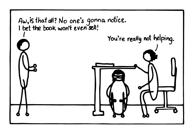
A friend of mine was venting to me about his old boss, who used to look over his reports. Whenever his boss found an error, he’d not only circle it but also emphasize his discovery with an exclamation point—a practice that drove my buddy nuts. Encoded within this tiny mark of punctuation was his micromanaging boss’s chiding disapproval: “HEY! THERE’S A MISTAKE RIGHT HERE! WHAT’S WRONG WITH YOU?”
I was relating this story to my good friend Naomi MacDougall, an award-winning designer, and she told me she once had to work with a proofreader whose markup she found “overly aggressive.” We both had a good laugh about that, but the conversation got me thinking: Whereas most of us have switched to editing on screen, a lot of us still proof on hard copy, and our markup is often the only communication we have with a designer, whom we may not know and may never meet. It’s a bit of a weird working relationship—more distant than others in the publication production chain. How can we be sure that our markup isn’t inadvertently pissing off the designer? I asked Naomi to sit down for an interview to talk about some of these issues.
IC: When you mentioned that a proofreader you’d worked with had “overly aggressive markup,” what did you mean by that? What did the proofreader do that rubbed you the wrong way?
NM: Mostly it was the use of all caps and lots of exclamation points at the end of every note. It made me feel as though I was being yelled at. The tone of the markup put me on the defensive.
IC: Are there other things proofreaders have done that you wish they wouldn’t do?
NM: There have been times when the markup hasn’t been clear, and obviously that’s tricky. It’s frustrating to have to sit there and puzzle over what a letter is. Also, occasionally, I feel like the markup has left too much for interpretation. Because we’re often going through these changes quickly, I don’t want to have to be deciphering code.
On the flip side, if something is very obvious in the markup—like if a letter is dropped or a word inserted into a sentence—then you don’t have to spell it out again by rewriting the sentence in the margin. But when there are lots of moving words and punctuation marks in a sentence, it’s really helpful if the proofreader rewrites the sentence in the margin.
I guess what I’m trying to say is that I’d like as much clarity as possible in markup. I’m intelligent, but I’m not a mind reader.
IC: When there’s a problem like a bad break or a widow, would you prefer that the proofreader just point out the problem so that you can find a solution, or would you rather the proofreader suggest a fix?
NM: That’s a good question. In most cases I would say just point out the problem, unless it’s obvious it’s going to be very tricky to fix—then it’s hugely appreciated when the proofreader suggests a fix, especially if it involves cutting or inserting words.
IC: What’s your preference when there are more extensive passages of text that need to be inserted? How long would an insert have to be before it’s better to send you new text in an email rather than writing it in the margin for you to rekey?
NM: I would say I’d want new text for anything longer than one sentence or two short sentences. There’s just more room for error when I have to type a bunch of text. And if you’re moving more than, say, four words around in a sentence, just rewrite the sentence and have me retype it. It takes less time than moving all those words around and making sure they’re all in the right place.
IC: I think you were telling me earlier that different proofreaders approach word substitutions differently. Some mark a word as deleted and then add a caret to show that a word in the margin should be inserted, whereas others just cross out the word in the proof and write its replacement in the margin, without the caret.
NM: Yes, I like the caret. I find it clearer.
IC: It’s a visual cue for the designer to look in the margin.
NM: Exactly. It takes out that second of guesswork.
IC: Which can really add up!
NM: Yes!
IC: Is there anything else proofreaders do that you really appreciate?
NM: I always appreciate a neat printer, and I always appreciate it when a proofreader uses a bright ink, like red or purple or anything that stands out against the type. Often I’m scanning a page quickly, and if the markup is in pencil or black or blue pen, I tend to miss more of the changes. They don’t jump off the page as easily, so I have to take more time to look at each page closely.
Also, I really appreciate it when the proofreader suggests a global change at the beginning of document if a word is misspelled throughout. It’s so much quicker for me to search and replace these in one go. But I also like it when these words are highlighted in the text so that I can double-check that the change was made and check for reflow, since, during a global change, there’s always the potential for a line to break differently.
IC: Do you ever return communication on the proofs? What kinds of things to you say to the proofreader?
NM: Not often, but if I do it’s almost always a note that a change can’t be made because of reflow issues—mostly to do with hyphenation. And occasionally I’ll make note of a design style that overrules a type change.
IC: We’ve focused on hard-copy markup so far. Any thoughts about proofreaders working on PDF?
NM: I know in some instances I’ve missed smaller fixes in PDFs, like a change to one letter or a punctuation change, because they’ll just show up as tiny, tiny marks, and they’re easy to miss even in the full list of changes. If you click on the markup and add a short comment to it, though, it pops up as a little box, so it jumps out.
PDFs are great for shorter publications; I can copy and paste the text right out of the markup boxes, so that makes my life easy! But for a big book, hard copy is preferable. Having to go back and forth between windows on the computer is the issue.
IC: How much does it annoy designers when we make a change on first proofs and reverse it on second?
NM: It’s not usually a big deal—unless it’s a complete change from Canadian to U.S. spelling throughout, say. If that ping-pongs, then it can get annoying—though I’m sure it is for everyone involved! In that case a note about global changes is hugely appreciated.
IC: What can a proofreader do to ensure that the relationship with the designer is as collegial and productive as it can be, given that it’s such a bizarre, arms-length interaction?
NM: If markup is done professionally, then the relationship will be smooth. Just be clear, be thorough, and print neatly… and no all-caps yelling!
IC: Yes! I think those are all of my questions. Do you have anything to add?
NM: Just that I appreciate how much work goes into a thorough proofread, and I don’t know how you all do it! Sometimes your hawk eyes blow my mind!
